Timeframe
January – February 2025
April 2025
January – February 2025
April 2025
Although global datasets like the UN's Sustainable Development Goals are publicly available, they often remain cognitively inaccessible to general audiences. In a 2025 survey, only 24% of business decision makers considered themselves data literate. This gap makes complex metrics feel distant and inaccessible—not only in understanding global issues but also in applying data within everyday decision-making—leading to missed opportunities for awareness, education, and meaningful action.
Art of Visual Data (AoVD) tackles the challenge of making complex global data accessible and understandable. This project removes the cognitive barrier of complex data through an engaging visual storytelling, accessible UI/UX, and gamified learning. By translating abstract statistics into human-centered visuals, AoVD empowers users to not only understand data but care about it—building data literacy while connecting to real-world problems.
Individual
While exploring global datasets, I realized that statistics alone rarely drive change—people connect with stories, not spreadsheets. To make the data resonate, I designed a platform that transforms impactful SDG indicators into narrative-driven experiences.
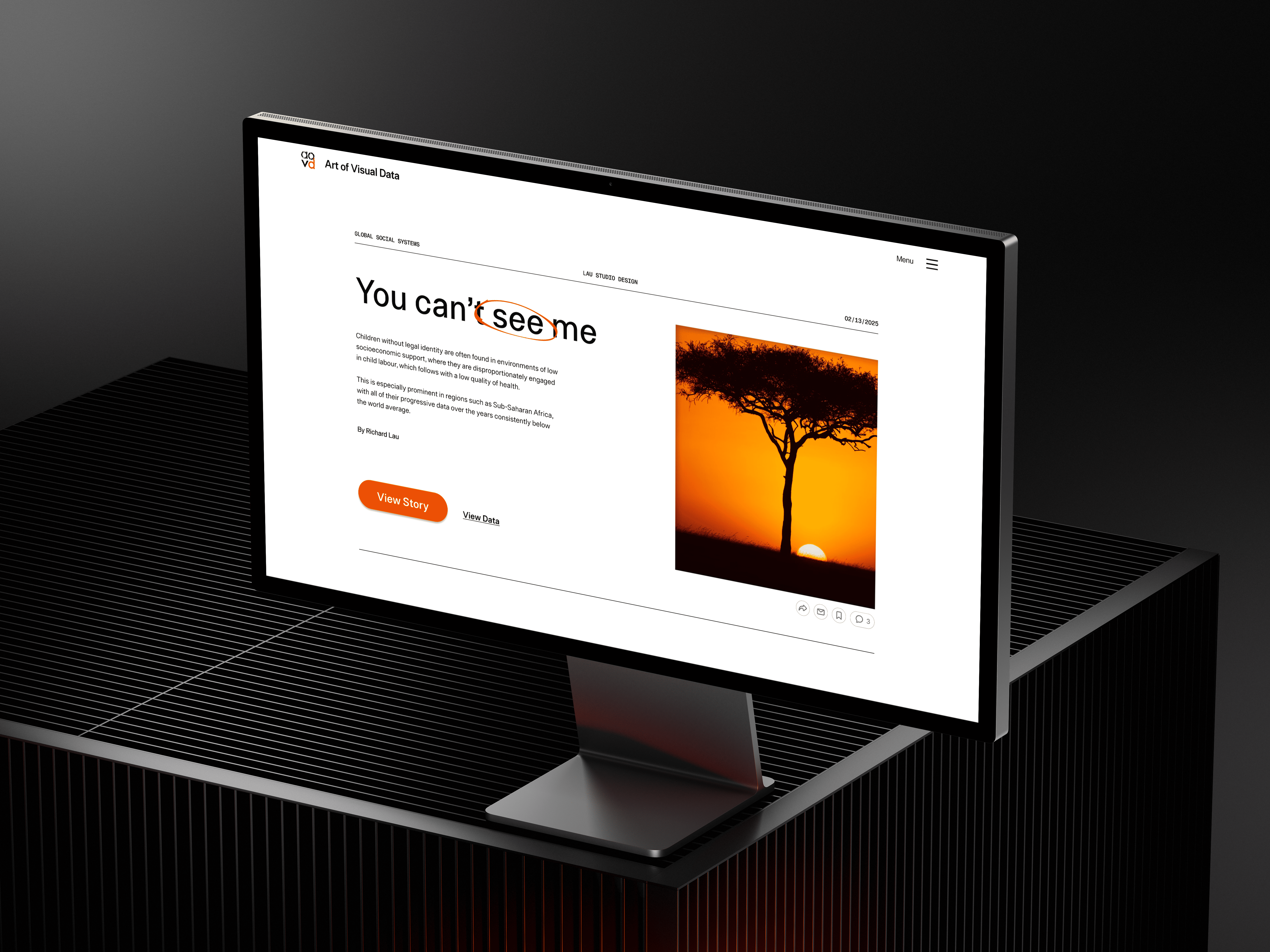
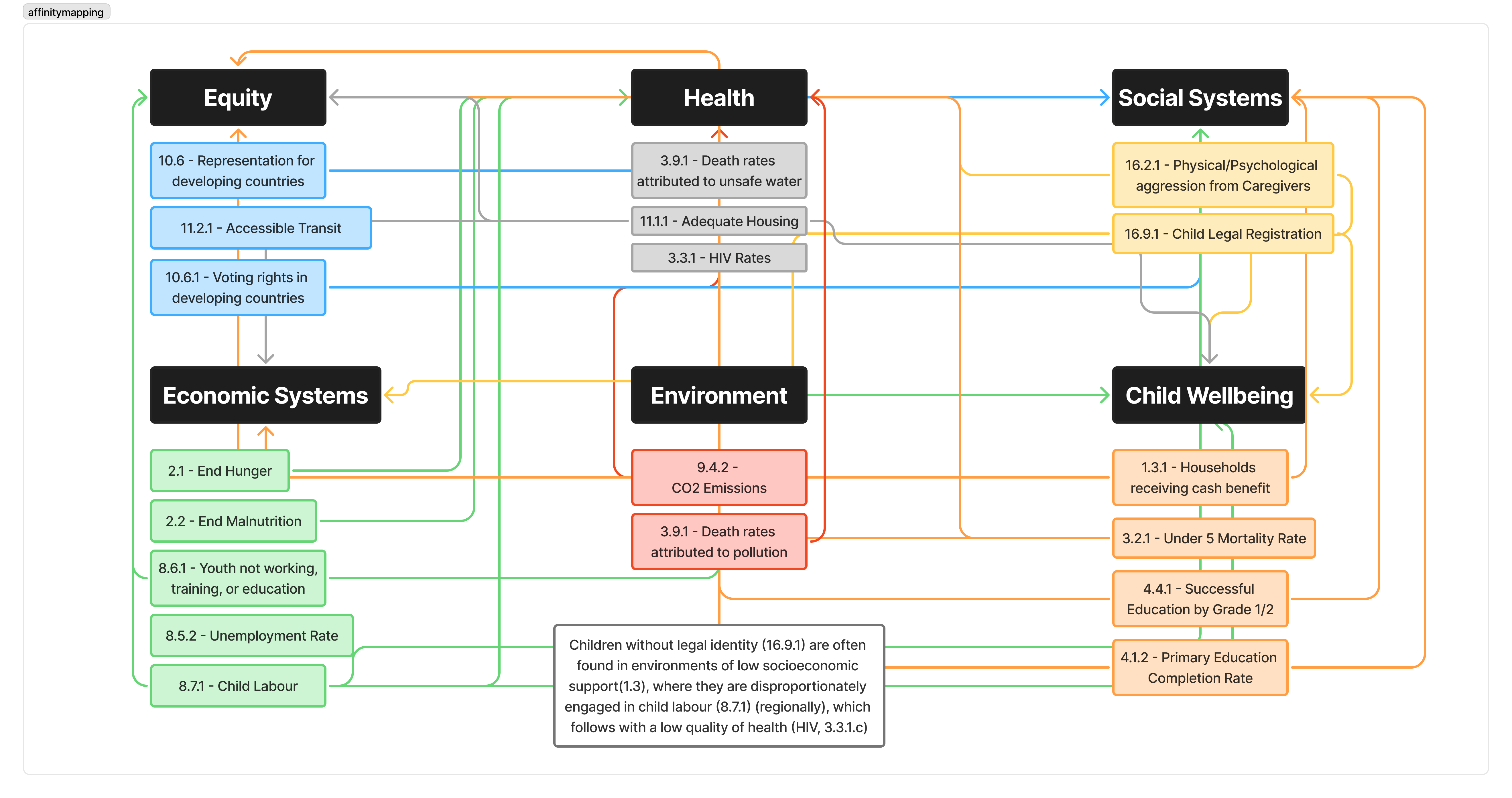
Looking through the 17 Sustainable Development Goals dataset, I set out to connect five different indicators to build an honest narrative that seeks emotional connection. Emotionally engaging stories can improve information retention by up to 70%. When we incorporate narratives and emotion within statistics, they become much more than numbers.
![Sustainable Development Goal Indicator datasets [1.3.1, 4.1.2, 3.3.1, 8.7.1, 16.9.1]. Five dense tables with data from varying years.](caseStudy1/rawDataset2.png)

Children without legal identity (16.9.1) are often found in environments of low socioeconomic support (1.3), where they are disproportionately engaged in child labour (8.7.1) (regionally), which follows with a low quality of health (HIV, 3.3.1.c).

The challenge would be to design a platform that presents a clear, unbiased statistical story by including all points of data (even with varying timelines), while creating an efficient way of consuming data that is both physically and cognitively accessible.

I'm Eris, I study International Development at UofT! I often need to pull statistics from datasets and translate them into reports and presentations. I'm also a visual & kinesthetic learner so I usually struggle with reading dense datasets.

I'm Lewis, I work with local communities to raise awareness about child welfare issues. I often use data summaries to do my work, but it's challenging for me to compare datasets. I wish I could visualize how the data moves!
I focused on the process of what it would be like for Eris to research and gather key insights on datasets for her university presentations. It examines how information overload and cognitive barriers hinder her ability and confidence in her research.
Goal: trying to gather key insights about global issues for her school presentation.
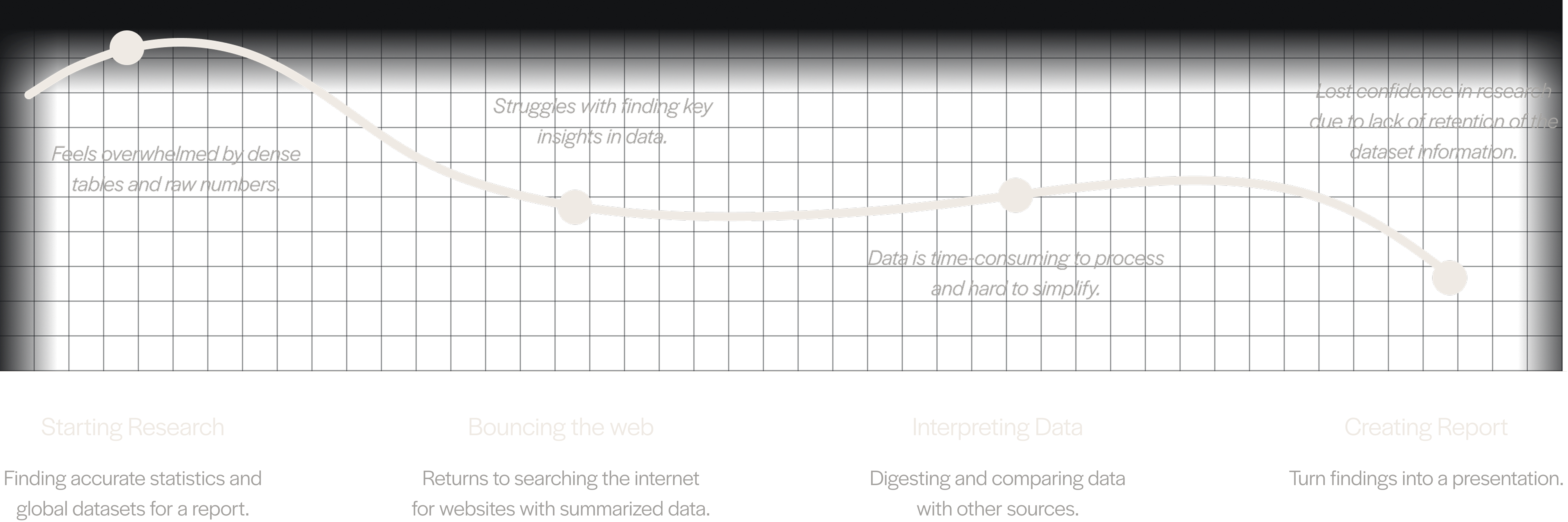


65% of the general population are visual learners, a learning style that research usually isn’t done in. It is essential that we are inclusive in the variability of all our user's abilities.

Only 24% of business decision makers considered themselves data literate. We need to improve user confidence and understanding in reading data.

Engaging stories improve information retention up to 70%. We need a unique tool able to compare multiple metrics and visually speak on how the data moves or their relationships.
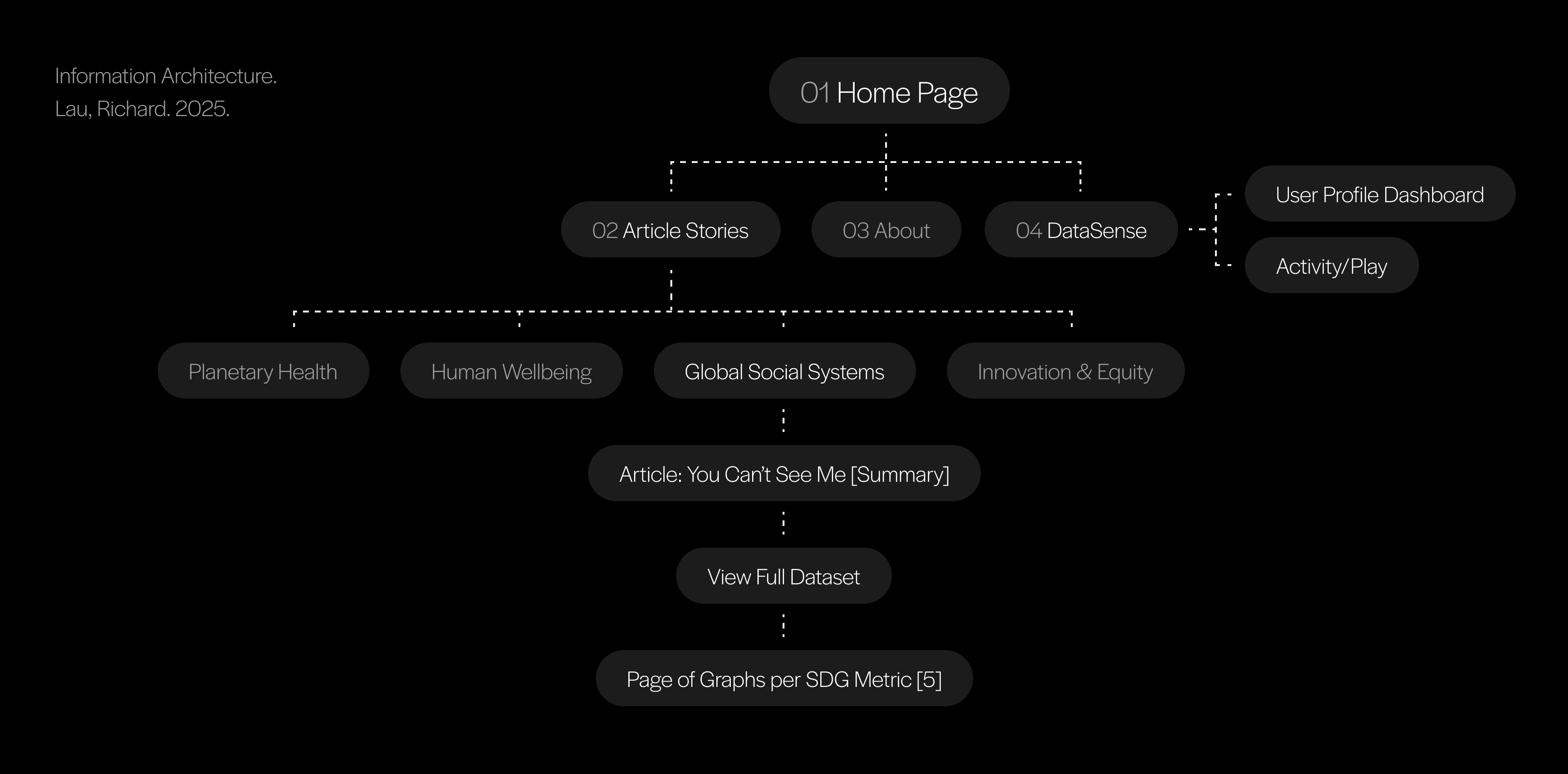
Mapping the primary navigation and content hierarchy helped clarified which screens were essential for the MVP. This ensured the website effectively supported the user journey, from initial entry on the Home Page to exploring articles and their in-depth content pages.
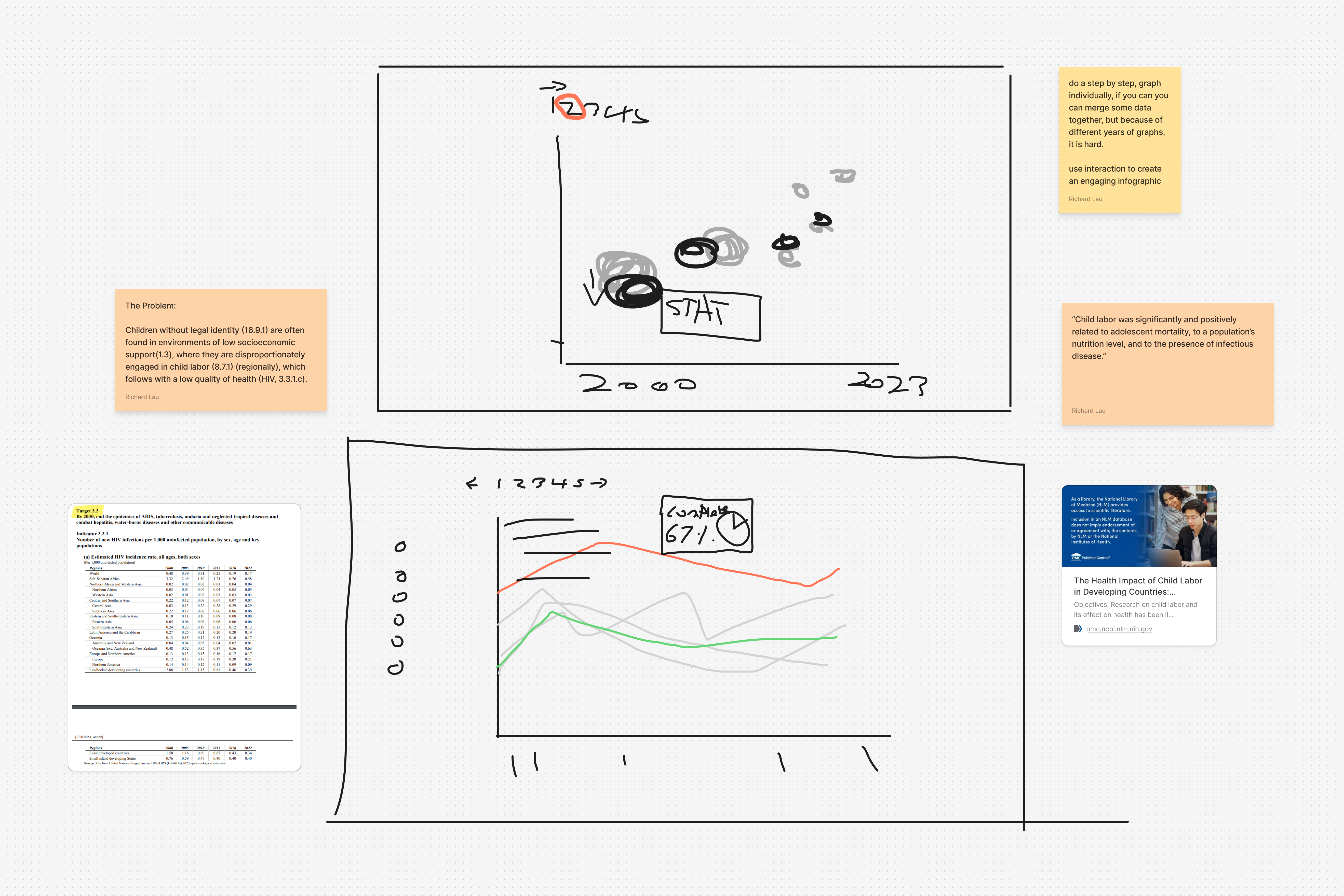
For our detailed datasets, what we're trying to create is a platform for stories from multiple SDG indicator datasets to compare, contrast, and show relationships between metrics.
We started with different ideations of how we can compare different metrics with each other, confronting the challenge of so many variables, timelines, and scales.
The types of graphs I decided to use were simple, commonly seen graphs such as bar graphs, pictograms, pie graphs, etc...
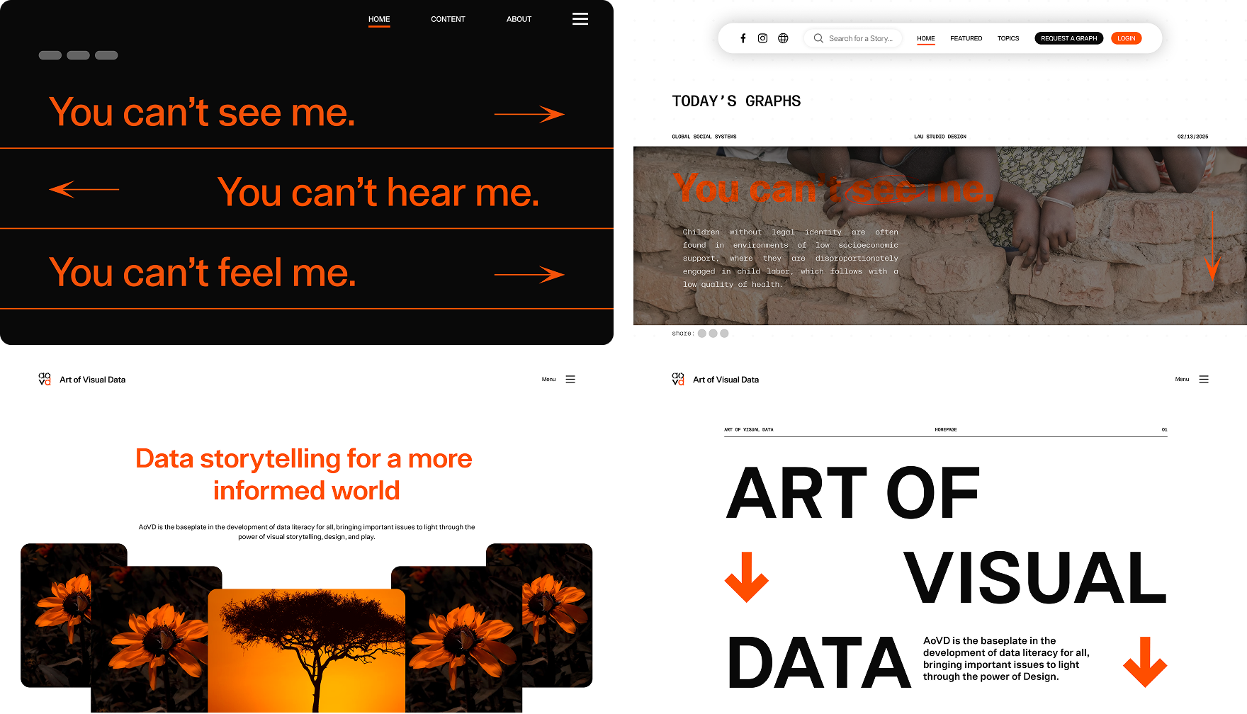
For the general style of this website, I started out with a black/orange colour palette, eventually switching to a light version.
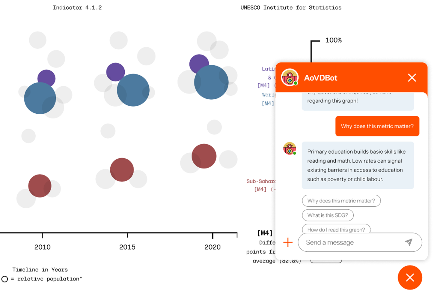
Although patterns and relationships is visually established as an upward trend, we lack linguistical confirmation. This challenges our linguistically learners as well as our weaker data readers. What we needed was a way to educate our users of the graph's context and contents.
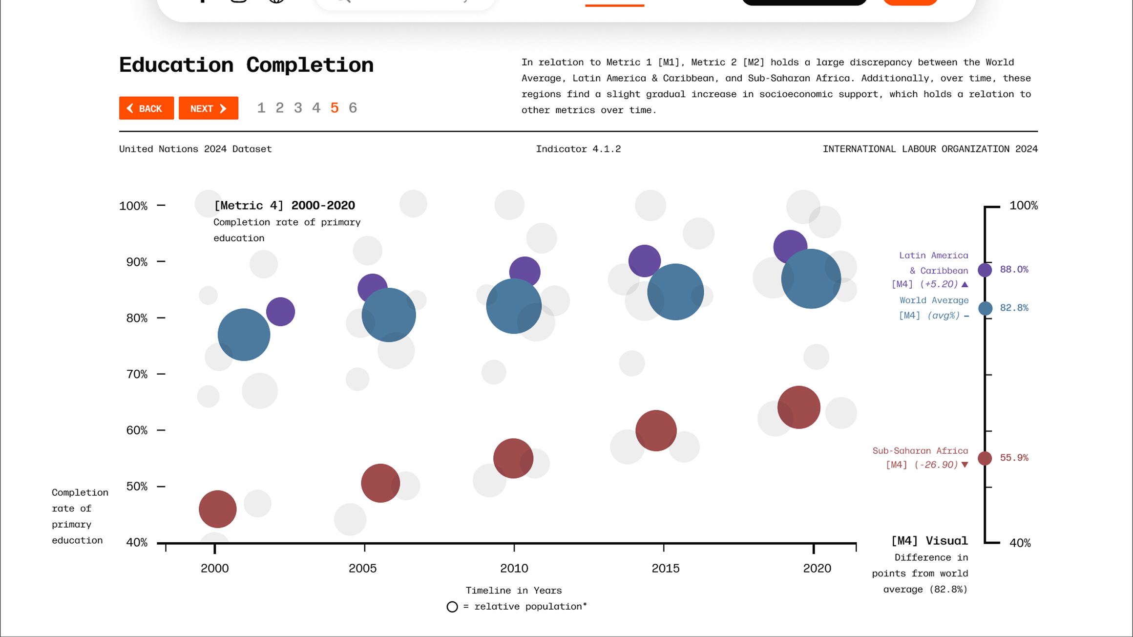
My solution was to implement a chatbot. We can utilize the linguistic strengths of Artificial Intelligence and implement a tool to maximize understanding and accessibility. This allows the user to pull specifics or get a general understanding of the data.
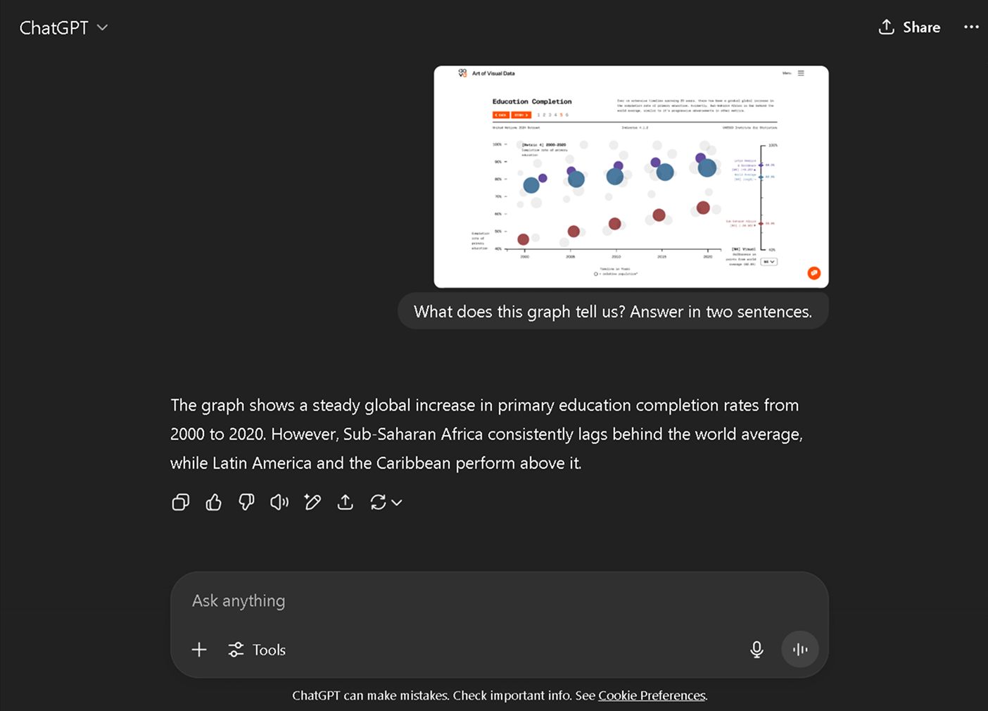
ChatGPT Prompting
AI Chatbot Implementation

By implementing an AI chatbot, the cognitive load required to interpret graphs is reduced, confidence is provided, and the time efficiency of reading and understanding graphs is increased. This benefits the user-experience and addresses the challenge of cognitive accessibility.
Art of Visual Data (AoVD) is a platform and brand that translates complex global datasets into visual stories, improving data literacy for all through accessible design, storytelling, and gamification. The ultimate goal of AoVD is to advocate awareness of global issues through the power of design.
The 'DataSense' tool of the AoVD website is designed for the general public interested in improving their data literacy skills. This tool gamifies learning with rankings, achievements, and Zeigarnik effect-based progress bars, encouraging reflection and long-term engagement.
Consistent graphing tools paired with chatbot support helped reduce information overload. This noticeably boosted user confidence by 60% and made navigating data more intuitive.

Instead of overwhelming users with raw data, we framed the experience around three core points. This helped with our storytelling, improved the efficiency of how our users made connections by over 67.7%.

To improved the user’s data comprehension speeds up by 9x, we utilized interactive elements such as hover effects and animated graph transitions to convey the full story without adding clutter.
I believe Art of Visual Data has the potential to innovate a world where we all understand each other a bit more better—not just through accessible media, but by actually voicing issues for those who lack representation themselves.
AoVD makes reading data so much more enjoyable compared to raw datasets.
— Eric, 3D Artist